C More Redesign
UX / UI and design system


A complete overhaul
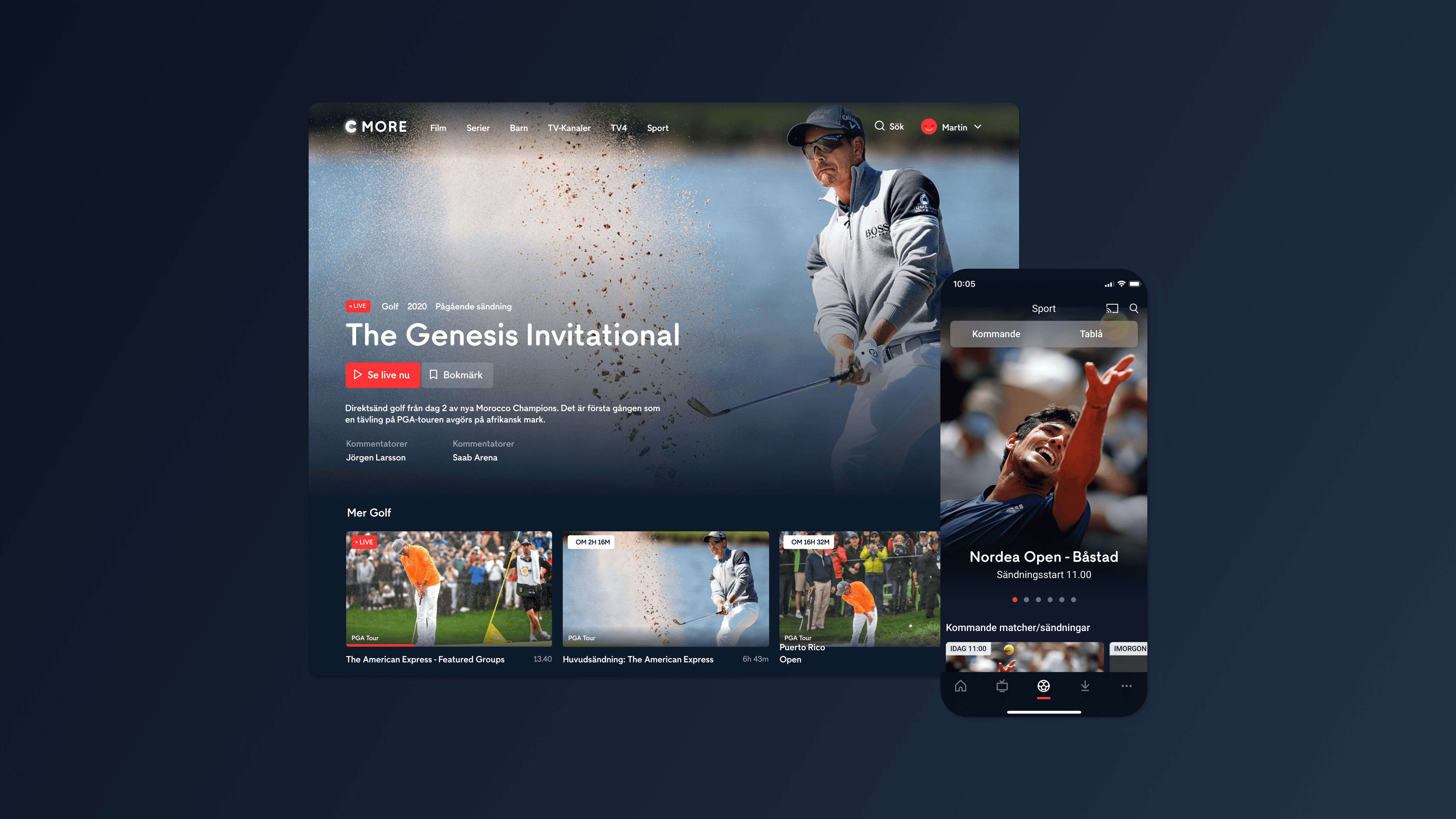
Due to the old design looking quite dated, C More was getting a rebrand, at the same time we had decided to move on from a hamburger menu to a tab navigation.
The result was a complete overhaul of the app, both from a UX and UI perspective. Even apart from just changing the colors to fit with the new brand, it was a golden opportunity to update all visuals to revitalize the whole service. These two major updates took C More from being a service that looked and felt outdated to feeling modern and sleek.
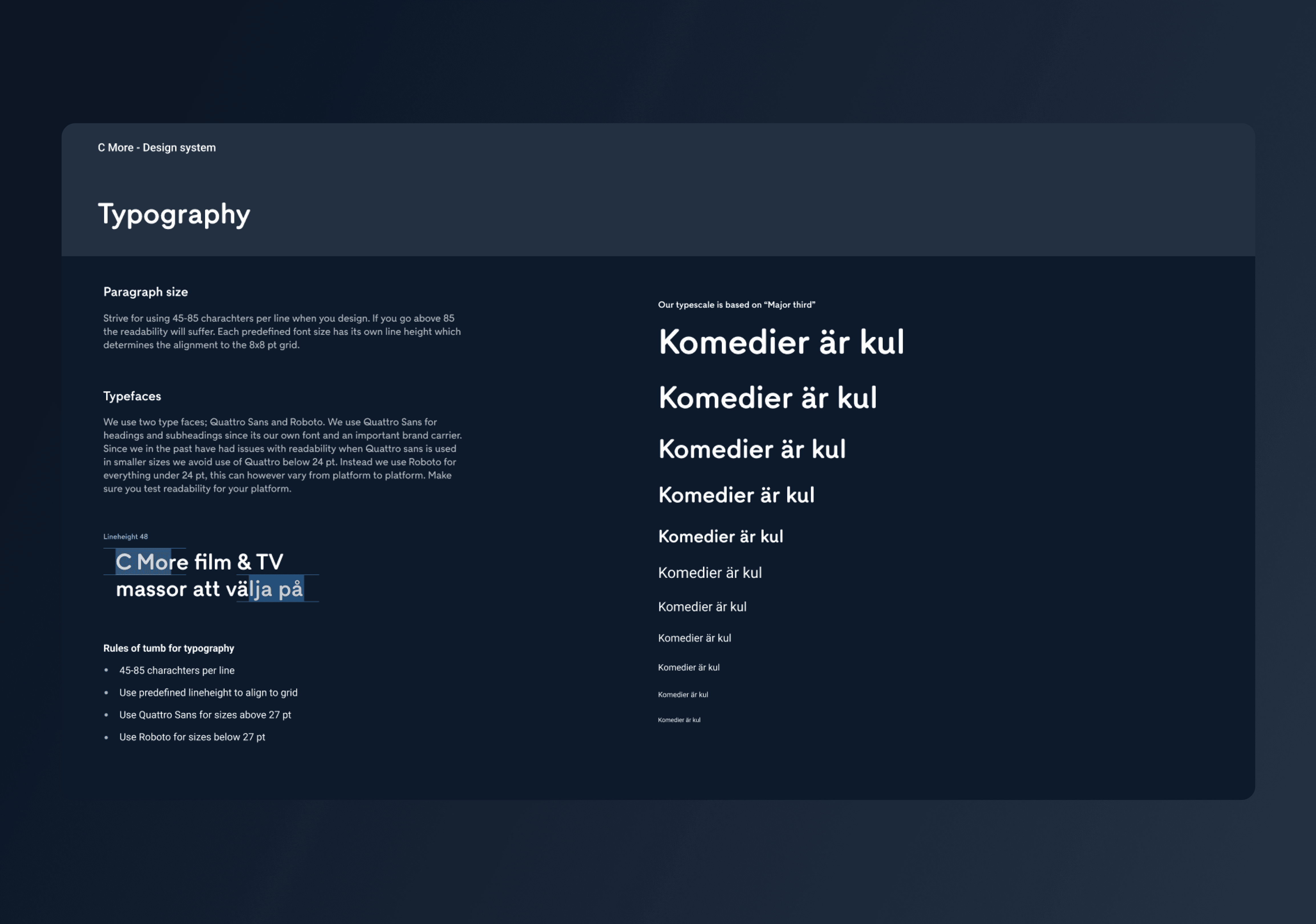
At the same time we took the chance to update and build a proper design system. The strategy was that which ever project needed a new component, designed it and checked with the rest of the team to keep the design coherent across all platforms.
My role
Being a part of a bigger design team, my role varied in different project but for the most part I was responsible for UI updates as well as creating the new navigation pattern. I also supported the work with the design system.
Working together with the data team we tracked what content was most popular and belonged on the start page. We could then use the same concept throughout the sub pages, like sport. We capitalized on C More’s very large library with great pictures to promote the content and awaken the users curiosity.

Since Tele2s portfolio grew with a lot of new products we needed to take that into consideration when designing navigation and purchase flows. A checkout that could handle all the different products separately but also in the long run could handle multiple product categories simulataneuously.

Working together with the data team we tracked what content was most popular and belonged on the start page. We could then use the same concept throughout the sub pages, like sport. We capitalized on C More’s very large library with great pictures to promote the content and awaken the users curiosity.

Working together with the data team we tracked what content was most popular and belonged on the start page. We could then use the same concept throughout the sub pages, like sport. We capitalized on C More’s very large library with great pictures to promote the content and awaken the users curiosity.


A cooperative effort
Since we were redesigning the whole service, the work with the design system was structured in such a way that the first designer that needed a component would check with the team and the designer who was responsible for maintaining the design system.
If the component was needed, they would create the component and add it to the system. This way we managed to work quickly without creating bottle necks.


A complete overhaul
Due to the old design looking quite dated, C More was getting a rebrand, at the same time we had decided to move on from a hamburger menu to a tab navigation.
The result was a complete overhaul of the app, both from a UX and UI perspective. Even apart from just changing the colors to fit with the new brand, it was a golden opportunity to update all visuals to revitalize the whole service. These two major updates took C More from being a service that looked and felt outdated to feeling modern and sleek.
At the same time we took the chance to update and build a proper design system. The strategy was that which ever project needed a new component, designed it and checked with the rest of the team to keep the design coherent across all platforms.
My role
Being a part of a bigger design team, my role varied in different project but for the most part I was responsible for UI updates as well as creating the new navigation pattern. I also supported the work with the design system.
C More Redesign
UX / UI and design system

